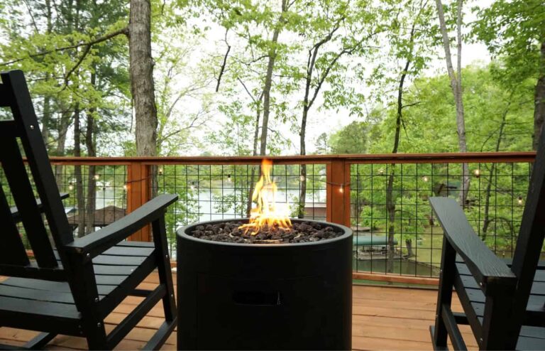
I often joke and say we bought a dock and it came with a house. But there is no one more excited for the challenge of turning our tiny fixer-upper on the shores of Lake Keowee into a dream home. I’m on a mission to turn this weathered house into a beautiful lakeside sanctuary—a place where memories will be made and cherished for years to come. The type of home where you walk in and you immediately feel comfortable and at home.
Because we are living in the house as we renovate and turn it into our dream home, we need to have a clean start. As a result, the first daunting task we had to tackle (and quickly) was deciding on a house color palette. When you walked into the house it was a mix of dreary ugly blue walls or walls that looked like they hadn’t been painted in 25+ years where the drywall was showing through the faded paint… It was gross.
What is a House Color Palette?
The first step in turning any new to you house into your home is updating and refreshing the paint. But gosh, this can feel like an overwhelming task as there are a million and one options. That is why coming up with your house color palette is crucial. If that term is new to you, like it was to me, basically it is 3-5 core colors you use in all rooms of your house. While some use this system in just one room of their home, I highly suggest you consider this system for your entire house.
Benefits of a House Color Palette
Creates Cohesion: By sticking to a consistent color scheme, your home will exude a sense of harmony and flow, making each room feel like a seamless extension of the next.
Simplifies Decision-Making: Say goodbye to paint paralysis! With a predetermined color palette, choosing paint colors becomes a breeze, saving you from decision fatigue.
Versatility: A cohesive color palette makes decorating a cinch. Whether you’re swapping out rugs or adding new accessories, everything effortlessly ties together.
Budget-Friendly: With a set color palette, you can repurpose leftover paint for touch-ups or small projects, saving you both time and money.
Crafting Our Lake House Color Palette
Now, onto the fun part—choosing our colors! For our lakeside retreat, we knew we wanted hues that would evoke a sense of warmth, inviting, and cozy like an Adirondack cabin. You know when you walk into a house that isn’t yours but you just feel at home, happy to flop on the couch or help yourself to a drink. This is the type of home I want, one where people feel welcomed and comfortable.
When it comes to choosing a color, the options seemed endless, but I had clarity on one thing – blue, gray, and gold while undeniably chic, didn’t resonate with our vision of a cozy Adirondack-style lake home. We craved warmth, charm, and a palette that would seamlessly blend with the rustic lakeside life we are living.
After much deliberation (and a few several Pinterest deep dives), we landed on the perfect trio:
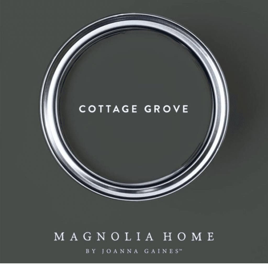
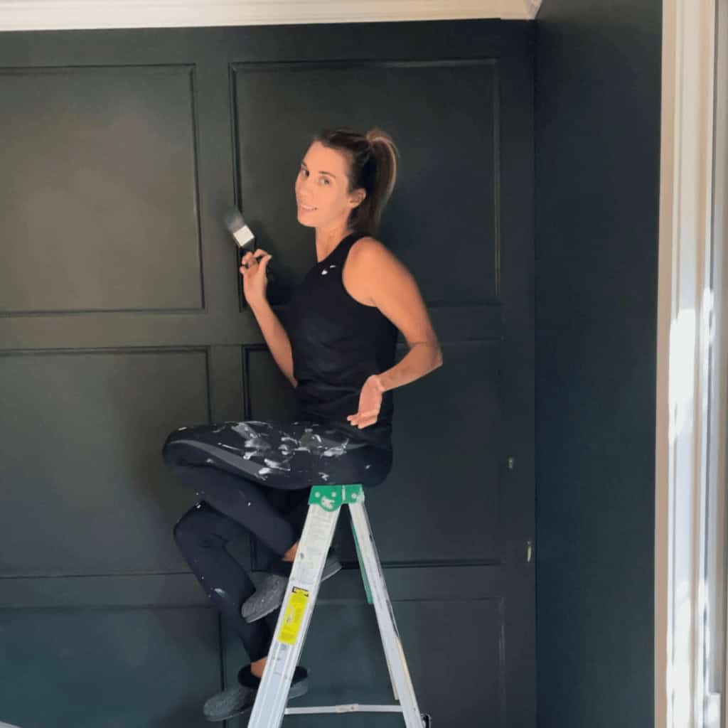
Cottage Grove by Magnolia Home: A rich navy green, my favorite color. There is nothing more perfect than this dark evergreenish green.
Alpaca by Sherwin Williams: A warm, inviting tan that would serve as the ideal accent, adding depth and warmth to our space.
Snowbound by Sherwin Williams: A crisp white to serve as our primary color, providing a clean backdrop for our lakeside adventures.
TIP: The first step in identifying your color palette is aligning colors with the feeling you want your house to represent. What is the feeling you want to embrace when you walk into your home? Do you want a modern, chic home or a warm and cozy, perhaps nostalgic? Identify this first. When you think of that feeling, the emotion you want to experience when you walk into your home, what color do you think of?
Bonus Tip: Regardless of the brand that came up with the color, you can have it mixed into your local Lowe’s paint. So while our house palette is not a Lowes specific color, the paint we use is all from Lowes. This saves LOTS of money!
Clarity
I don’t recommend checking out a paint wall at Lowes or any paint store even if you know the “feel” you are going for. The options feel endless, it’s overwhelming and due to the bright lights and the small swatch, it’s hard to understand how this will look in your house.
Rather- go to Pinterest. As you find a color you would love to incorporate in your home search the color name on Pinterest- You will then be pointed to color pairings and there will be plenty of photos seeing this color styled in other people’s homes. Pick 3-5 colors (personally, I say stick to 3 colors) and now you have the vibe for your house! /
A Fresh Look
Painting the walls gave us a fresh start… It turned this tiny tired house into a clean slate. An opportunity to make it our own, and start to develop our renovation wish list. We painted every room (luckily, there aren’t too many) at record speed all because we have a house color palette. The truth is, if we had to pick out a different color scheme for each room it would have taken WAY longer and cost a heck of a lot more. Using a house color palette allowed us to make one decision and ultimately it made updating each room easier.
As the walls transformed, so too did the ambiance of our home. Gone were the days of dreary, dirty walls. We are starting to create the charm and character we desire. It is amazing what paint can do for the vibe of your home.
Sitting and looking out at the lake, I can’t help but smile at how far we’ve come in such a short time. While we still have a long way to go to turn our tiny fixer-upper into a dream lake house. We are making progress, and because the rooms have all been painted the house is starting to feel a bit more like home.
What are the primary colors in your home? Do you have a house color palette?

